Amadeo
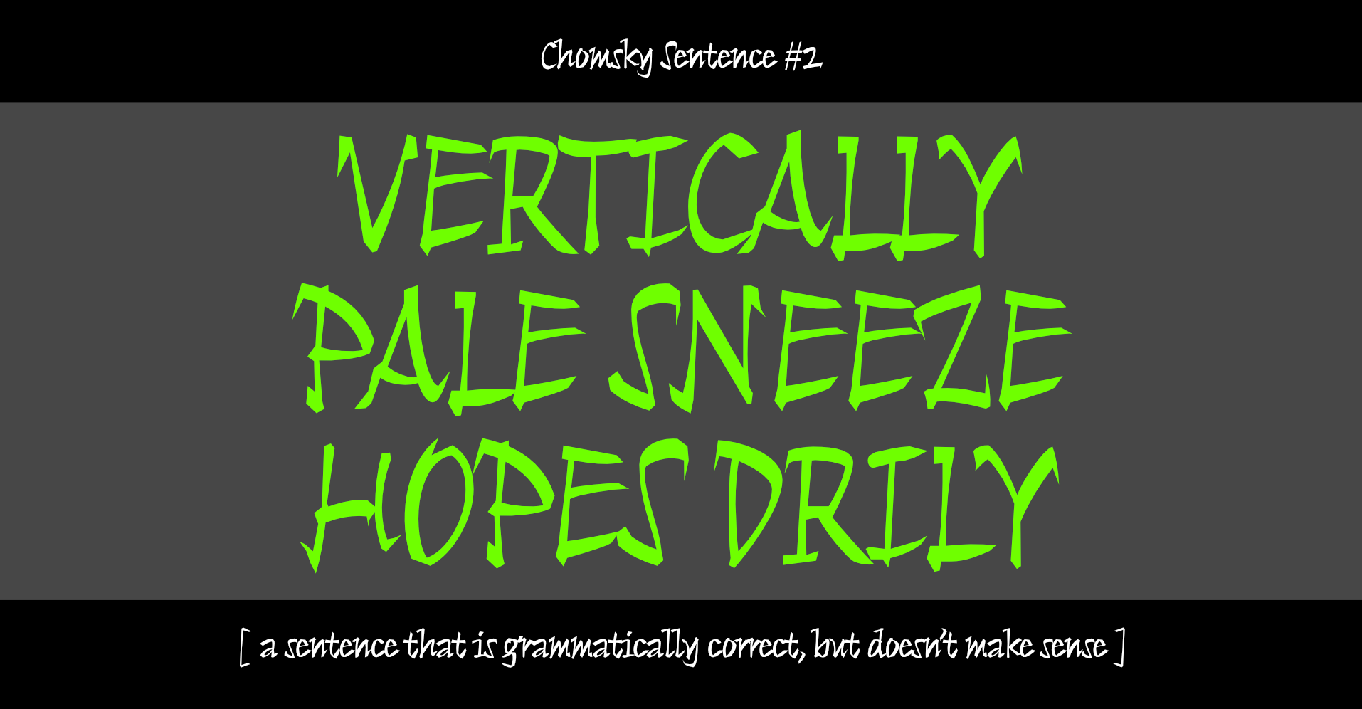
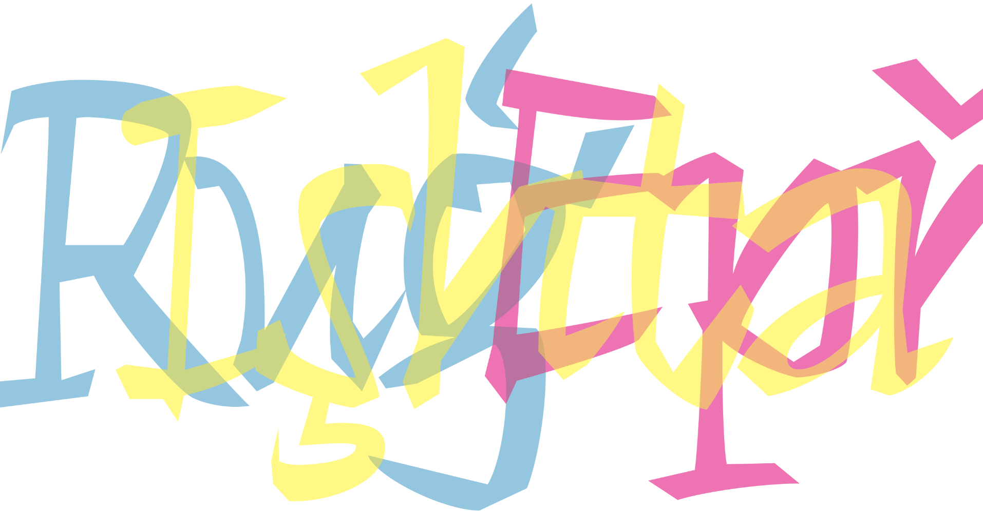
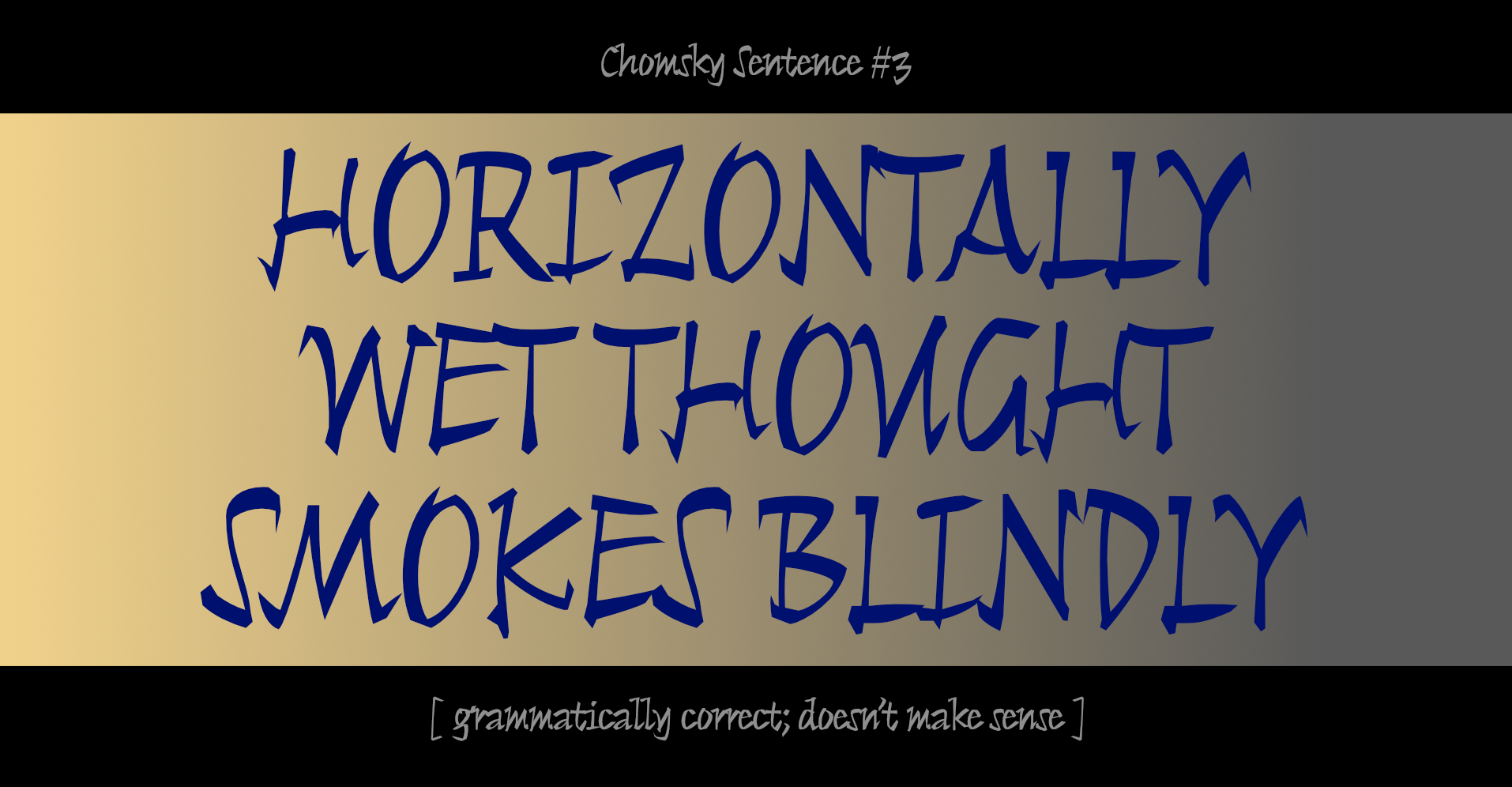
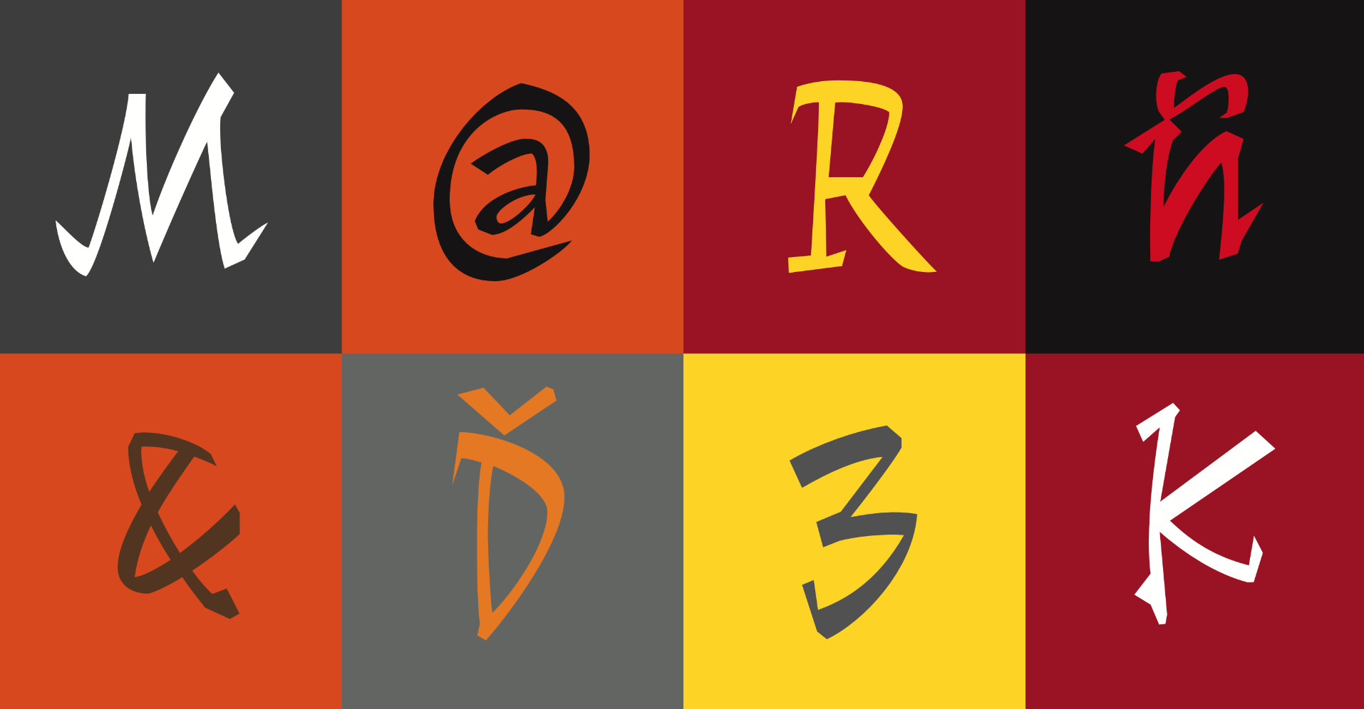
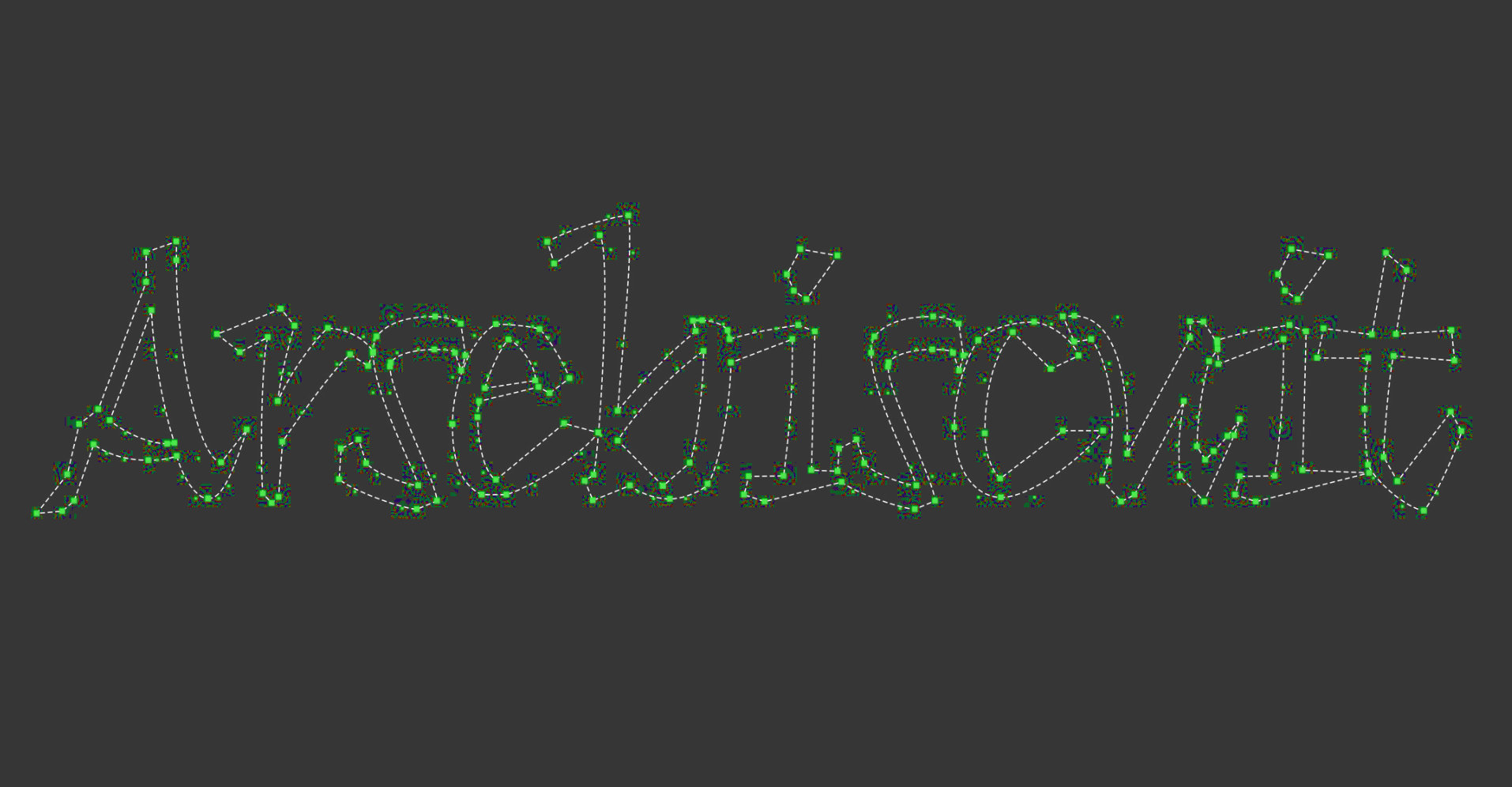
In 1996 I sent a design to the Morisawa Typeface Competition. It won a prize. This is what I said about it at the time: ✚ More of our previously Carolingian lettershapes, de-contextualised by writing them with a cheap marker at the wrong pen angle. The weight distribution is uneven too. Most people would say it would never work as a typeface. This is what the judges said: ✚ Adopting the pen script method, this typeface fully expresses the good qualities of hand written letters and yet, it is very beautiful in text composition. It is designed to give a texture of calligraphy brush writing and would probably make a good match with Kanji characters. Parts of the letters look as if they have been cut off with a knife. This font has rhythm and is beautiful in typesetting and calculated to show a unique texture, not seen in ordinary Latin typefaces ¶ I thought I was naming the typeface after the painter, Modigliani: I liked the music of his first name but I now realise that I have spelt it incorrectly. No matter: I prefer my choice of vowels and I adore a happenstance neologism! There are related designs in the works, if you are interested in those, it would be a good idea to sign-up for the newsletter using the link at the top of the page, as that is where wee previews will be shown, and where they will be announced. You will be able to see the original design – as presented in Morisawa’s brochure – by scrolling the gallery above.